The Poster Evolution
August 15, 2017
In Paris in the nineteenth century, Jules Chéret and the other grand masters of the lithographic poster—Alphonse Mucha, Théophile-Alexandre Steinlen, Eugène Grasset, and Henri de Toulouse-Lautrec—took the medium from mere informational advertising to high art, causing the medium’s popularity to skyrocket.
The trend started in Paris but quickly spread, evolving into a lasting and approachable art form that continues the original aims of eye-catching design and powerful communication—whether about a shop, company, event, product, or idea. Let’s take a look at just a few landmark poster artists who owe a debt of history to the poster’s golden age during the Belle Époque, but reinvigorated the medium in keeping with cultural change.
Designer: Leonetto Cappiello (1875–1942)
Purpose: Advertisement for the French aperitif Maurin Quina
Year: 1906

A cunning advertiser who moved to Paris in 1898, Leonetto Cappiello invented the idea of associating one image or character with certain products. We take this technique for granted today, having accepted Kellogg’s Tony the Tiger, the Geico Gecko, and Mrs. Butterworth as regular parts of our modern life.
In one famous example by Cappiello above, an emerald-colored demon with a forked tail cast an atmosphere of devilish allure over the French aperitif Maurin Quina. With this character, Cappiello intentionally sparked associations with absinthe, the infamous Belle Époque drink also known as la fée verte (the green fairy).
Designer: John Hassall (1868–1948)
Purpose: Advertisement for Britain’s Great Northern Railway
Year: 1908
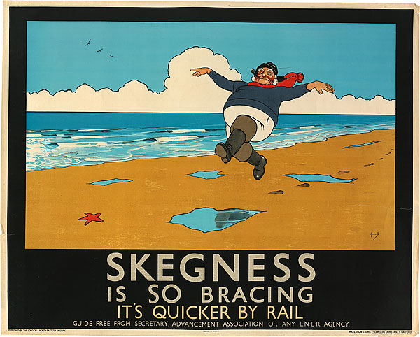
English illustrator John Hassall’s hilarious take on Jules Chéret’s flouncing chérettesfor a seaside town along Britain’s Great Northern Railway made for one of the most popular poster images of the twentieth century. A chubby, rosy-cheeked fisherman in Wellington boots and a vivid red scarf skips buoyantly along the beach, promising a delightful, good-weather vacation for the whole family. The Jolly Fisherman, as he’s called, is still a beloved icon of the town of Skegness today.
Designer: James Montgomery Flagg (1877–1960)
Purpose: U.S. Army recruitment (World War I)
Year: 1917
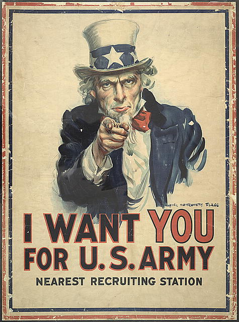
The first half of the twentieth century saw much of the world engaged in large-scale war. Luxury sundries and entertainment were less prolific in wartime, while the government had great need for poster designs to recruit soldiers, encourage the public, and establish impressions of the enemy. James Montgomery Flagg’s I Want YOU for the U.S. Army is perhaps the single most recognizable American poster. It was published as a magazine cover in 1916. The following spring, the United States officially declared war on Germany. The image then began appearing as posters with a blank space available at the bottom, so the printer could jot in an address for the nearest recruiting station.
Designer: E. McKnight Kauffer (1890–1954)
Purpose: Advertisement for The Daily Herald
Year: 1919
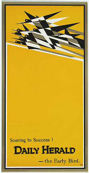
E. McKnight Kauffer’s stark image of birds, streaking across a yellow sky as a single mass of geometric black and white, heralded a new era of modernism in poster design. The poster, first printed in 1919 for London’s Daily Herald, embodied new aspirations for the machine age after the conclusion of the First World War. The campaign organizer, Sir Francis Meyness, described it as “a flight of birds that might almost be a flight of aeroplanes; a symbol, in those days of hope, of the unity of useful invention and natural things.”
Designer: Heinz Schulz-Neudmann (1899-1969)
Purpose: Promotional poster for the film Metropolis
Year: 1926
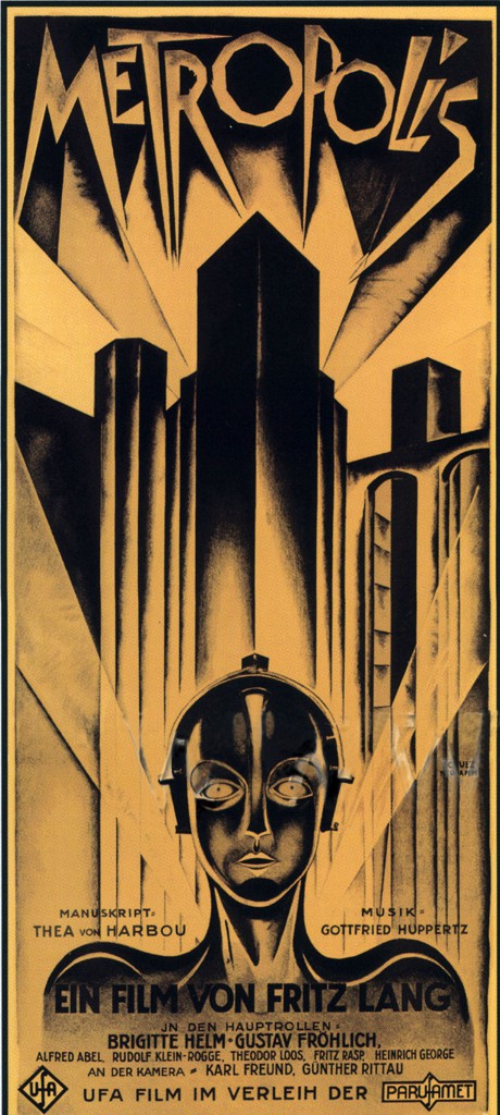
The influence of Futurism, an artistic movement that started in Italy in the early twentieth century, is unapologetically clear in this rigidly geometric, monochromatic poster design by Heinz Schulz-Neudamm for a German dystopian sci-fi film by Fritz Lang. Emphasizing the uneasy relationship between man and machine in the post-industrial era, the figure in this poster is arranged almost uncomfortably close to the viewer, with the rigid city skyline far behind. Neudamm’s visual theme here had lasting effect; only look to the 2013 poster for the film The Great Gatsby to see how this style is still associated with the so-called Roaring Twenties.
Designer: A.M. Cassandre (1901–1968)
Purpose: Promotional posters for steamship travel
Year: 1931, 1935
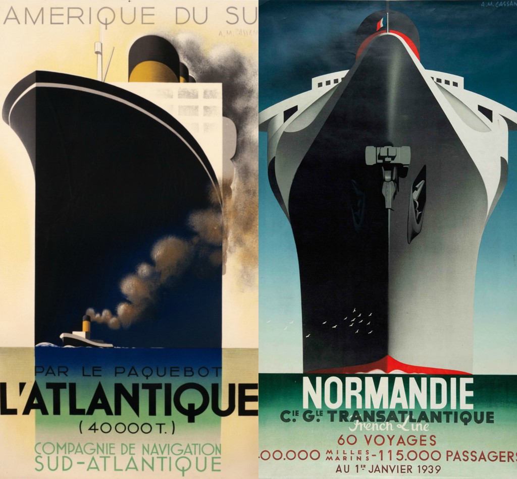
A.M. Cassandre, a Ukranian émigré who landed in the rich artistic soil of Paris, drew inspiration from the latest avant-garde art movements, including Cubism and Futurism, for his travel posters. He arranged flat fields of color in dramatic but simple compositions to convey the strength of these trans-Atlantic ships. Notice how he uses the birds in Normandie and tugboat in L’Atlantique to exaggerate their size.
Designer: Lester Beall (1903–1969)
Purpose: Promotion for the Rural Electrification Administration (REA)
Year: 1937
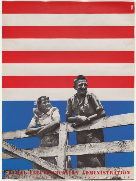
Lester Beall created comforting nationalistic photomontages on bright American flag backgrounds for the New Deal program’s Rural Electrification Commission in the 1930s. They were meant to help communicate technological changes to rural communities across the United States, a vast majority of which didn’t have electricity yet. But as with many paintings, murals, and prints that came out of Franklin D. Roosevelt’s New Deal, Beall’s modernist vision made this series of posters works of art in their own right.
Designer: J. Howard Miller
Purpose: Morale-boosting poster for Westinghouse Electric (World War II)
Year: 1943
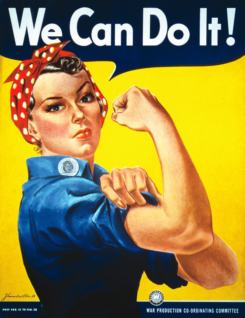
Although it didn’t become famous until years later, this is another wartime image indelibly stamped on American visual culture. Pennsylvania manufacturer Westinghouse Electric hired J. Howard Miller to produce a poster that would boost worker morale and celebrate the difficult work they were doing to produce wartime goods. Many worker posters of the period showed men with their sleeves rolled up, ready to work for their country, but this one celebrated the contribution of women to the manufacturing industry. Miller created a naturalistic, wholesome illustration here, almost like the popular Normal Rockwell paintings of quiet family life from the same period, but charged it with vivid, attention-grabbing color.
Designer: Milton Glaser
Purpose: Record insert for musician Bob Dylan
Year: 1967
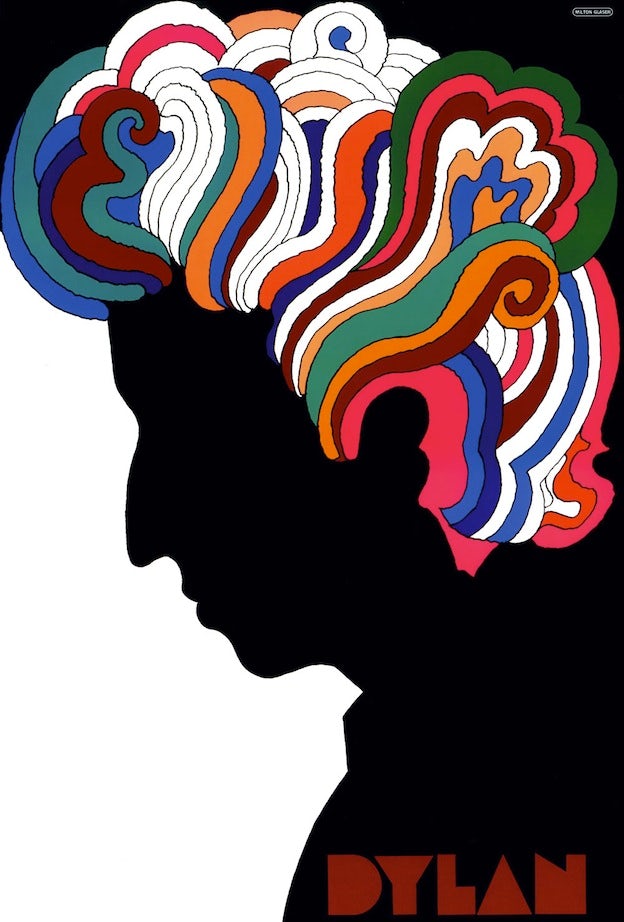
The 1960s in America brought a contemporary spin on the florid Art Nouveau styles explored in Alphonse Mucha’s posters of the late 1800s. The psychedelic poster craze combined Art Nouveau’s fluid, nature-inspired lines with the wild colors and dreamlike shapes of surrealism. These images iconized an era of unencumbered exploration of sex, drugs, and rock ‘n roll in art and culture. In the above poster, specially commissioned by CBS Records to accompany the album Bob Dylan’s Greatest Hits, Milton Glaser rendered the music star’s curly hair in swirls of psychedelic color.
Designer: Paul Rand
Purpose: Advertisement for computer technology corporation IBM
Year: 1981

With the increasing dominance of photography as a visual medium, posters placed greater emphasis on text and typeface as an expressive graphic element. This is something the grand masters of the late nineteenth century had already experimented with, often writing a cabaret or product name by hand in decorative script. But this poster by Paul Rand takes an emphasis on text to another level. In his minimalistic composition on a field of black, Rand places three simple images, two of which are clever pictograms — an eye and a bee, to communicate the “I” and “B” in the company’s name, respectively — and only one of which, the ‘M,’ is recognizable as part of the company’s now-famous logo.
Designer: Shepard Fairey
Purpose: Promotional poster for Barack Obama’s 2008 presidential campaign
Year: 2006
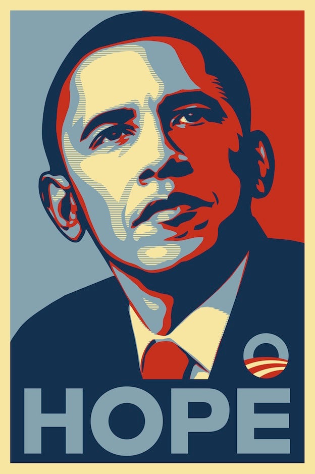
Former president Barack Obama successfully campaigned in a presidential race against Senator John McCain on a promise of “Hope.” This heavily 1960s Pop Art-inspired poster by Shepard Fairey, an American street artist and graphic designer, communicated the message in intense hues of red, beige, and blue. Peter Schjeldahl, longtime art critic at The New Yorker, said it was “the most efficacious American political illustration since Uncle Sam Wants You” (see above).
…
Resources:
“A Brief History of the Poster,” International Poster Gallery.
“Collecting Guide: 8 poster designers to follow at auction,” Christie’s, October 16, 2015.
“Collection: Egon Schiele: Secession 49. Austellung, 1918.” The Stedelijk Museum.
“Edward McKnight Kauffer (1890 – 1954), Soaring to Success!" Daily Herald – The Early Bird. Lot essay, Christie’s Vintage Posters sale, 13 May 2010, London.
“Hope and Glory: A Shepard Fairey Moment,” Peter Schjeldahl, The New Yorker, February 23, 2009. http://www.newyorker.com/magazine/2009/02/23/hope-and-glory
“Skegness is SO bracing.” The Victoria and Albert Museum. http://collections.vam.ac.uk/item/O74309/skegness-is-so-bracing-poster-hassall-john/
“The Birth of the Modern Poster,” National Gallery of Australia exhibition 10 February – 13 May 2007. https://nga.gov.au/modernposter/“Top 15 Poster Designs in History,” Sean Coady, Creative Market, May 2, 2016. https://creativemarket.com/blog/top-15-poster-designs-in-history