Jules Chéret and the History of the Artistic Poster
March 14, 2017
The Broadside
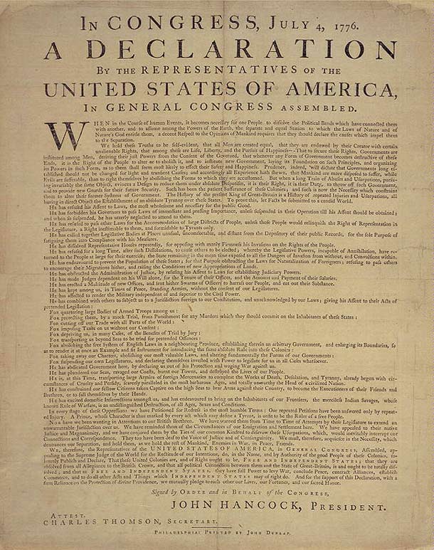
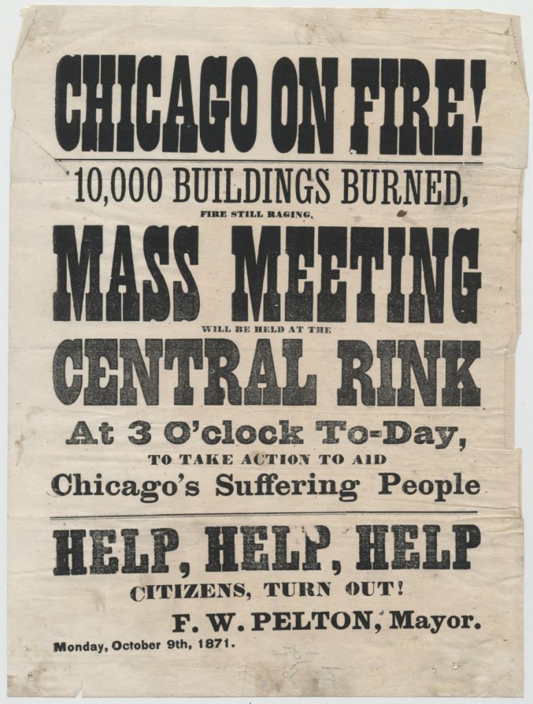
The history of the poster starts with black-and-white broadsides in the 1600s, which evolved in the wake of the printing press. These one-sided sheets of paper were a quick way to mass-distribute information. Shopkeepers propped product announcements in their windows; governments called people to action in the event of war; public decrees were quickly distributed. A wanted poster of the old American West would be a classic example of a broadside. The Declaration of Independence is also a famous example; printed as a broadside, news of the victorious revolution spread quickly throughout the American colonies.
A Turning Point
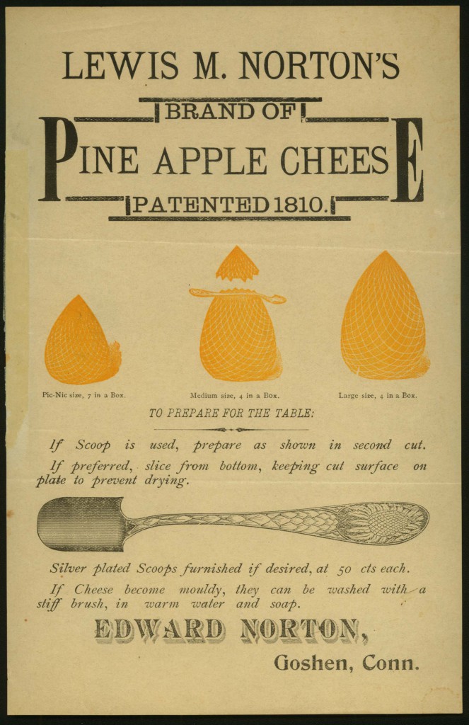
Broadsides were an ephemeral form—easily printed, distributed for quick impact, read for the information they contained, and then tossed away. But as time passed and technology advanced, the broadside evolved. Typefaces got a little more interesting—larger, more decorative. Images were added to grab a viewer’s attention.
And then a turning point came in the 19th century in Paris. The poster transcended its role as attention-getting carrier of practical information. It became beautiful. It became desirable. It transformed the gray urban commute into a pleasurable stroll punctuated by cheerful color. It became the passion of a group of aficionados who avidly collected these posters, preserving them from the short life cycle of ephemera. In short, the poster became art.
So how did it happen?
There are a number of factors: the rise of the middle class in Paris with more expendable income for collecting, advances in technology that allowed for larger and more complex poster designs, a multicultural milieu with artists of all types mingling and sharing ideas in Paris’s bohemian neighborhoods, a city redesign that included street furniture designed specifically for posters, and more.
But one of the central factors is the reinvention of lithography, the process by which many posters were made before they became fine art.
And Jules Chéret is the one who reinvented it. Chéret is widely known as the father of the modern poster, and it is in his footsteps that the rest of the major artists in the Driehaus Museum exhibition, L’Affichomania: The Passion for French Posters, followed.
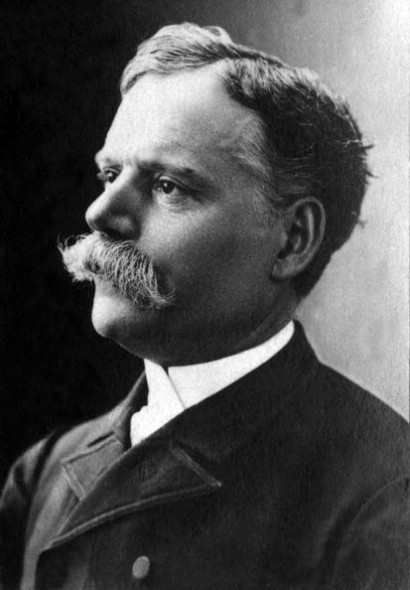
Jules Chéret
Chéret was born in 1836, the son of a French typesetter in Paris. He briefly studied drawing, then started training at age 13 in lithography, working as an apprentice and journeyman in Paris and London for 17 years. He got his break when perfume manufacturer Eugène Rimmel hired him as a designer. Soon after he started his own lithographic printing firm in Paris, firmly believing that lithography would soon replace his father’s letterpress industry as the premier printing technique.

Lithography
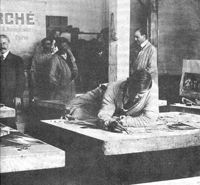
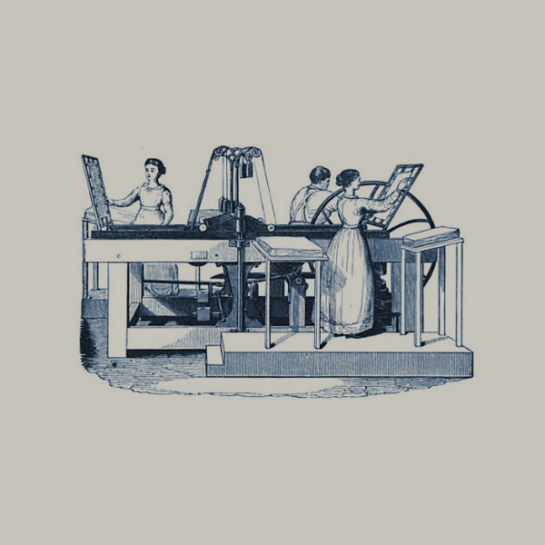
Lithography wasn’t new. It was invented in 1798 by a Bavarian actor and playwright, Alois Senefelder, to reproduce his scripts. Senefelder’s printing process is simple to understand if you keep in mind that oil and water don’t mix. To make a lithograph, you take a greasy or waxy crayon and draw images or words onto a large, smooth limestone surface. Then you douse the surface of the stone in water and roll it with ink. The greasy drawing repels the water and soaks up the ink, while the wet areas without any drawing repel the ink. So when you press the stone—with considerable force—onto a piece of paper, it transfers the inky images and text onto that paper.
If you wanted a color lithograph, also called a chromolithograph, things got a little more complicated. You had to prepare as many stones as you want colors. It was laborious and the stones were incredibly heavy, so lithographs remained pretty much monochromatic well into the 1860s. If color was utilized at all, it was a little splash as a highlight to the heavily crammed text, and not a core part of the visual design.
The Artistic Poster
Given the lack of design consideration, low quality, and disposability of earlier commercial lithographs, lithography got a reputation as an unworthy artistic medium. To say that you were making lithographic art in the 19th century would be like printing a full-page advertisement in a glossy beauty magazine today and calling it your chosen artistic medium. It isn’t impossible. It would simply be difficult for many to imagine elevating this medium we associate with makeup advertisements to the realm of museum collections. It was the same with lithography. It suffered from its association with quick and commercial information. There was nothing daring, original, or beautiful about lithography.
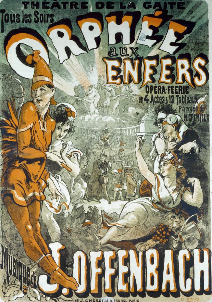
That is, until Jules Chéret. Visionary artists often take an idea or form that already exists and transform it so completely that it appears new and original. This was the case with Chéret, who appeared unconstrained by the negative associations with lithography and decided to use it for colorful, cheerful, and vivaciously French artworks. In 1884 Chéret organized the first group poster exhibition in art history, ushering in an era of these images being accepted—and enthusiastically celebrated—as fine art, and in 1886 he published the first book on poster art. Chéret would also eventually work with printing houses that catered to collectors who wanted poster art for their own.
Chéret made advances to lithography in the mid-19th century that others would soon imitate. He designed his own lettering, taking advantage of the fact that the lithograph, as opposed to the printing press, allows for the artist to draw freehand on the stone’s surface. The text therefore became a part of the poster’s overall design. Chéret also reduced the amount of text, leaning heavily on the image to communicate about a product or event. He also simplified the chromolithographic process by using three primary colors: three stones inked with red, yellow, and blue. By making these colors semi-transparent, he could layer them and create different shades. Finally, Chéret approached the limestone in a painterly way, using animated brush lines, crosshatch, stipple, soft watercolor-like washes, and areas of flat color. A fellow chromolithographer, André Mellerio, heralded this fine art of the street, calling the new color poster “the distinctive art of our time.”
Chéret’s creative advances transformed the world of advertising. His posters featured cheerful, lightly clad, often eight-feet tall beauties who became known as Chérettes. Chéret’s women were inspired by the well-heeled, garden-party women of Rococo paintings, a glorious age in France immortalized by artists like Jean-Honoré Fragonard and Jean-Antoine Watteau. These alluring women showcased the pleasures of Paris to tantalizing effect, including music halls, theatres, performers, beverages, medicines, and lamp oil.
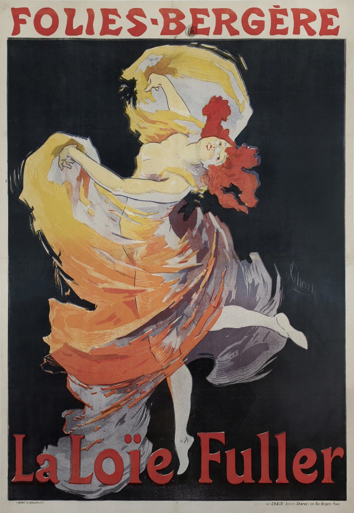 Folies-Bergère: La Loïe Fuller, 1893.
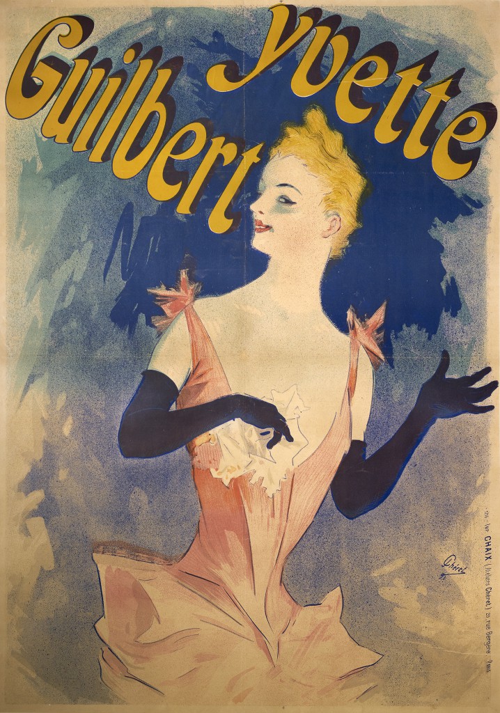 Yvette Guilbert: Au Concert Parisien, 1891.
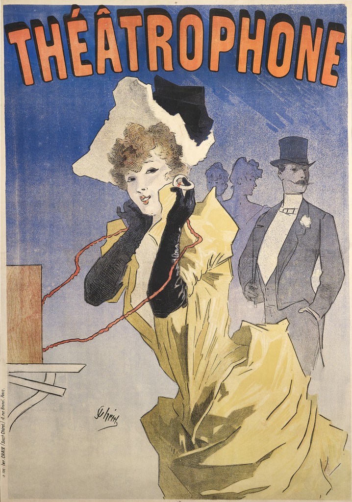 Théâtrophone, 1890.
Chéret was recognized in his own time as ‘the king of the poster’. One art critic remarked that “there was a thousand times more talent in the smallest of Chéret’s posters than in the majority of the pictures on the walls of the Paris Salon.” He was often imitated, and an entire generation of artists would follow and build on his work. One of them was Henri de Toulouse-Lautrec. To acknowledge his debt to the older artist, Lautrec sent Chéret a copy of every poster he produced.
After creating more than a thousand posters in Paris, Chéret retired to Nice in the south of France, where a museum was established in his honor in 1928, four years before the artist died at the age of 96. The Musée des Beaux-Arts Des Nice, as it’s called today, still stands as a testament to the artist’s transformation of the world of fine art.
Resources
Eskilson, Stephen. Graphic Design: A New History
Encyclopaedia Britannica, “Jules Cheret.” Updated July 21, 2009.
Graphic Design History’s “History of Posters” series
Hamilton, Sarah Elizabeth. From Publicity to Intimacy: The Poster in Fin-de-siecle Paris
Ives, Colta. “Lithography in the Nineteenth Century,” Heilbrunn Timeline of Art History, The Metropolitan The L’Affichomania: The Passion for French Posters, essay by Jeannine Falino. The Richard H. Driehaus Museum. The Monacelli Press, New York, 2017.
Museum of Modern Art, gallery labels on works by Jules Chéret (moma.org/collection)
Museum of Art. October 2004.
“A Brief History of Broadsides,” Tavistock Books